Skip to content

The work

Ten storefronts. Ten verticals.Built to be looked at closely.

Ten complete storefronts, each designed for a different kind of shop and given its own visual system — nothing shared between them but the standard. Full type, real interaction, working behaviour at phone width. Open any one and you get the phone capture too, scrolled end to end, because that is the screen your shoppers will actually be holding.

storefronts built
10storefronts built
retail verticals
10retail verticals
visual systems
10visual systems
average accessibility score
90average accessibility score
ms blocking time, on all ten
0ms blocking time, on all ten
captures, desktop and phone
20captures, desktop and phone

Read this first

Every build below is ours, and every brand on it is invented. Fieldnote, Auravant, UNIT—07 and the rest do not exist — no shop commissioned them and nothing was ever sold through one, so there is no sales figure, no conversion rate and no uplift to quote, and we are not going to invent any. What is genuinely on offer is the craft: what each build demonstrates, and how far the set stretches across different kinds of shop.

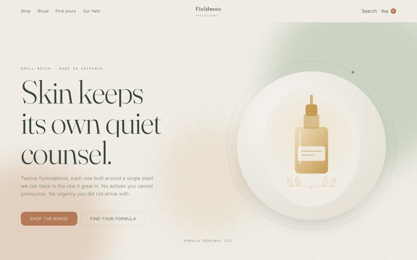
Desktop storefront design for Fieldnote Apothecary: a pale bone page with wide margins, soft green accents and a quiet serif headline.

Demonstration build · invented brand

Fieldnote Apothecary

Skincare & apothecary · Organic minimal

Botanical calm, generous white space, slow deliberate motion.

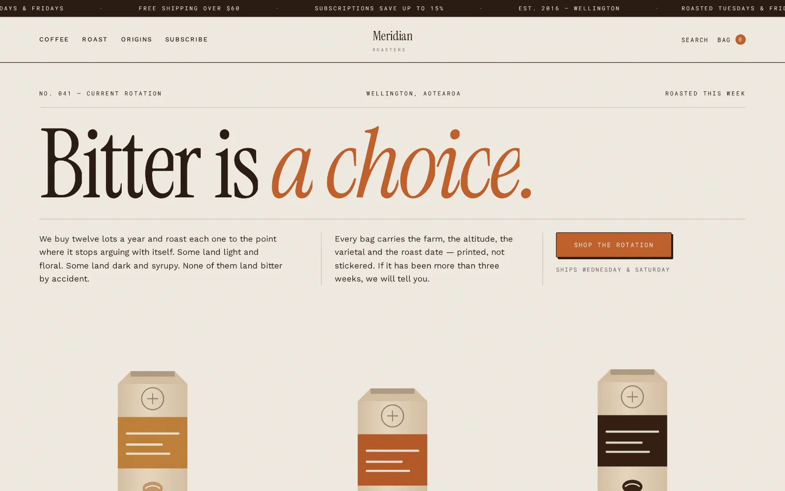
Desktop storefront design for Meridian Roasters: warm paper-toned layout with editorial type, a burnt-orange accent.

Demonstration build · invented brand

Meridian Roasters

Coffee roastery · Warm editorial

Letterpress warmth, paper grain, and a roast slider that actually filters the shelf.

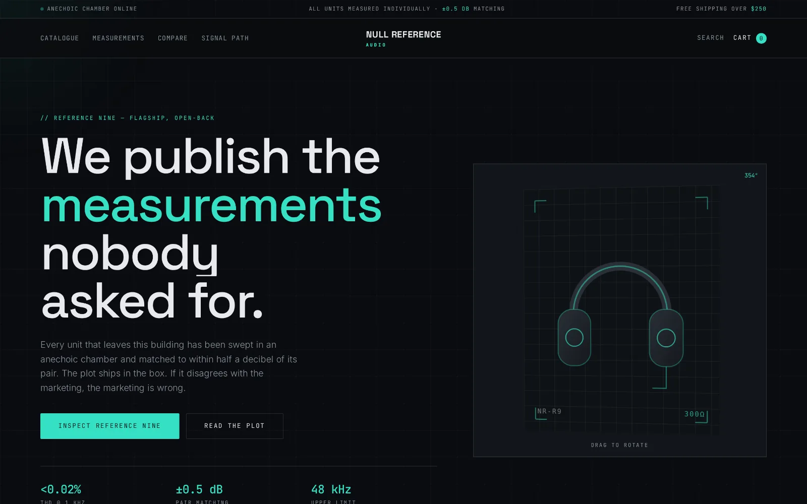
Desktop storefront design for Null Reference Audio: near-black instrument-panel layout with monospace labels and a mint-green data accent.

Demonstration build · invented brand

Null Reference Audio

Hi-fi audio & electronics · Dark technical

Instrument-panel dark, monospace data, and a frequency plot you can scrub.

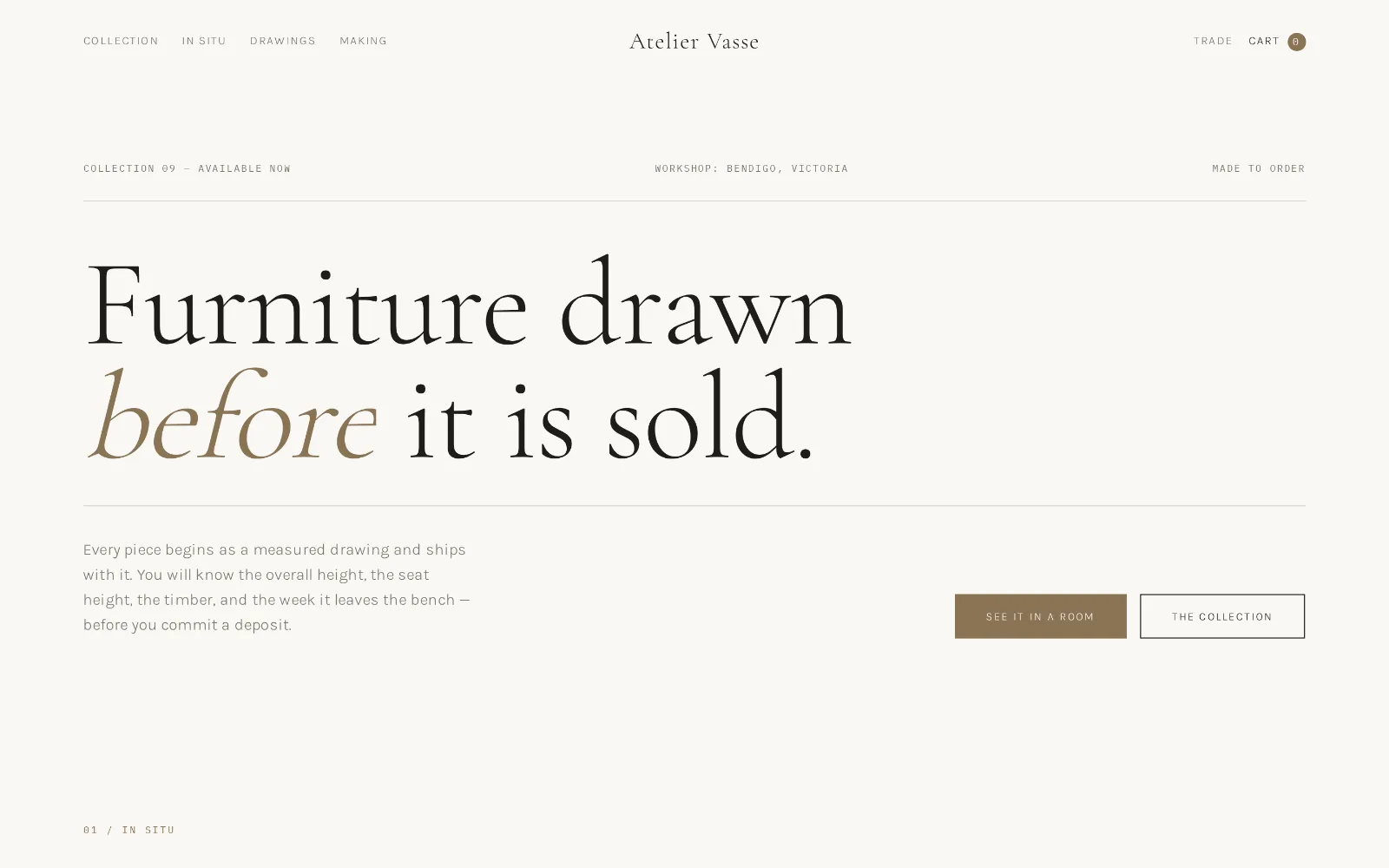
Desktop storefront design for Atelier Vasse: an off-white page with an oversized serif headline reading “Furniture drawn before it is sold”, a thin rule of specification data, and a brass-toned button.

Demonstration build · invented brand

Atelier Vasse

Furniture & home · Architectural

Bone paper, one serif line set the full width of the page, and a rule of specification data above it.

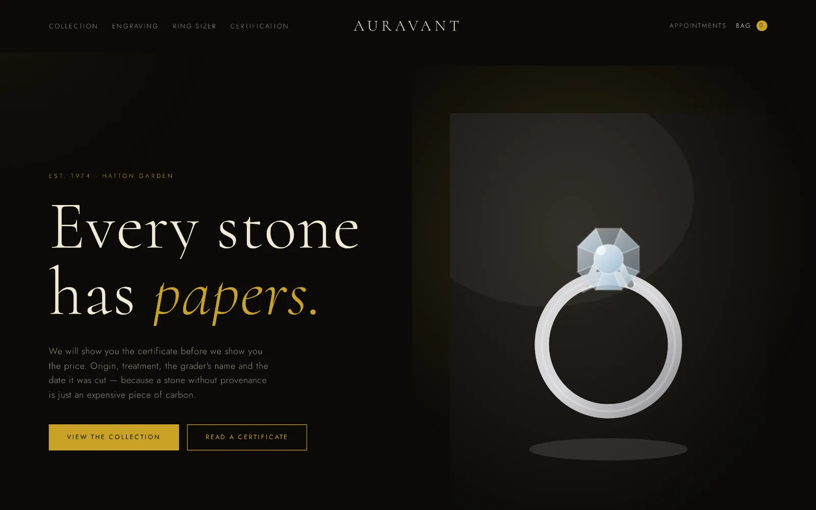
Desktop storefront design for Auravant Fine Jewellery: a near-black page with a lit solitaire ring on the right, cream serif headline reading “Every stone has papers”, and gold buttons.

Demonstration build · invented brand

Auravant Fine Jewellery

Fine jewellery · Dark luxe

A near-black stage, one lit ring, and the certificate offered before the price.

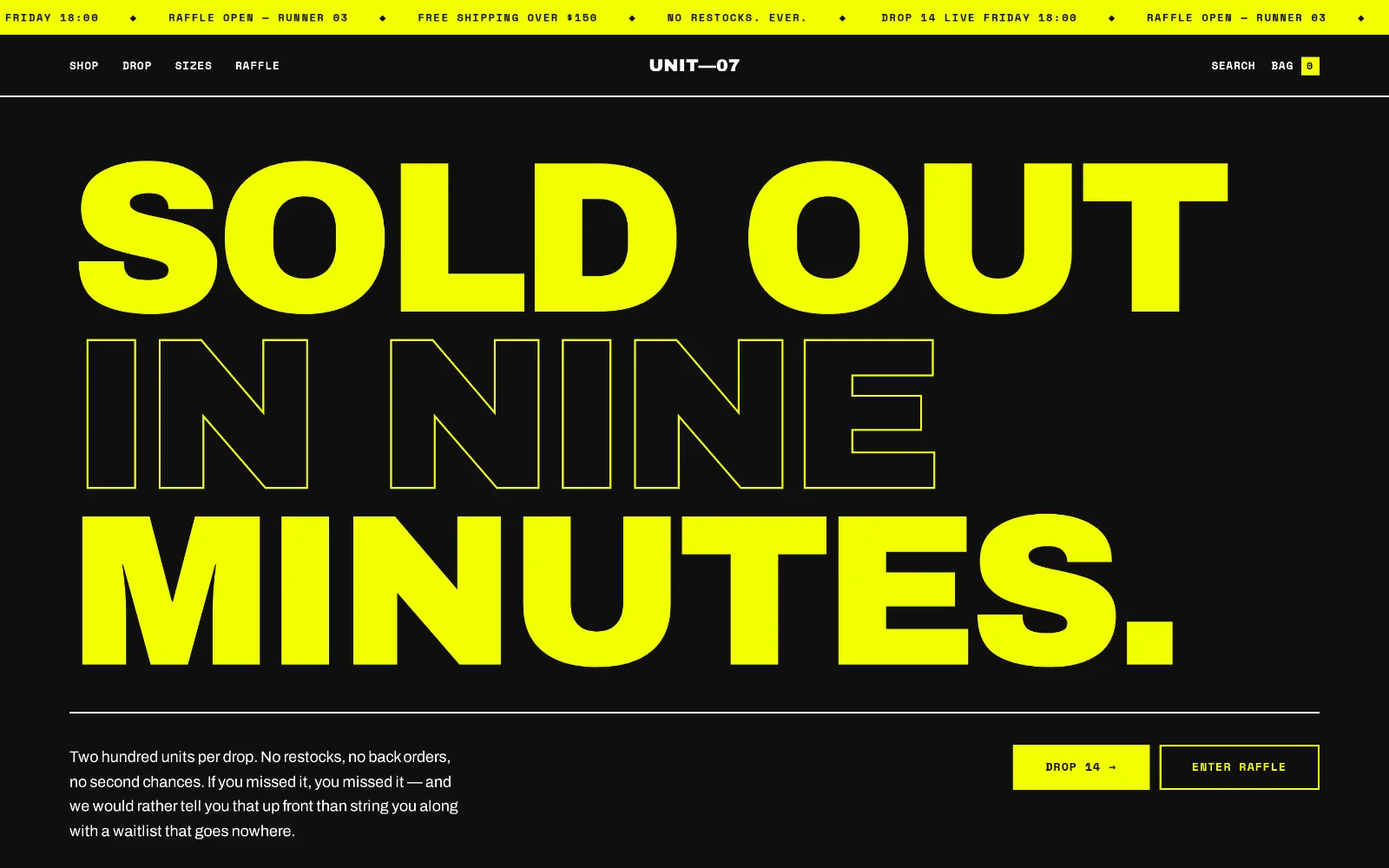
Desktop storefront design for UNIT—07 Supply: a black page with a yellow ticker bar and an enormous headline in solid and outlined yellow type filling the screen.

Demonstration build · invented brand

UNIT—07 Supply

Streetwear & sneakers · Brutalist kinetic

Acid yellow on black, a running ticker across the top, and a headline that fills the whole viewport in alternating solid and outline weights.

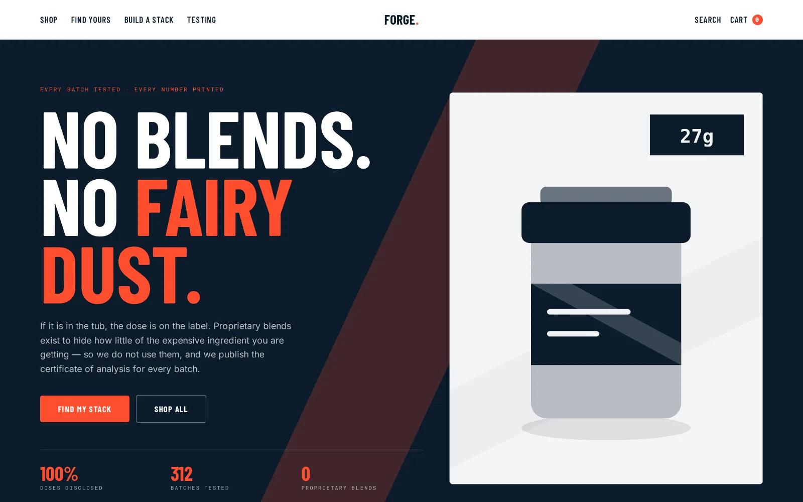
Desktop storefront design for Forge Nutrition: a deep navy page with condensed white and orange-red caps reading “No blends. No fairy dust.”, a product tub illustration and a row of figures beneath.

Demonstration build · invented brand

Forge Nutrition

Fitness & supplements · Bold data-driven

Deep navy under condensed caps, an orange-red accent, and a row of figures sitting on the fold line.

Desktop capture of the Marchetti Cellar design: a near-black age-verification screen with a letter-spaced serif wordmark, the question “Are you of legal drinking age?”, and an oxblood confirm button.

Demonstration build · invented brand

Marchetti Cellar

Wine & spirits · Moody vintage editorial

Opens on the age gate — oxblood on near-black, a letter-spaced serif wordmark, and nothing else until you answer.

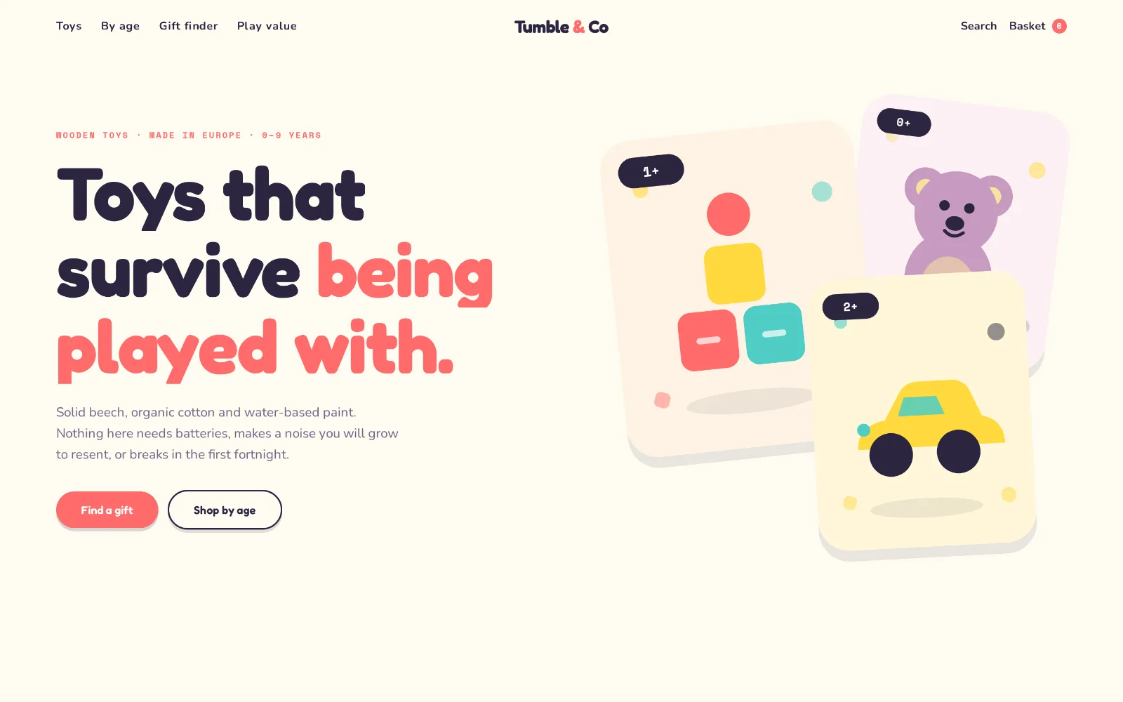
Desktop storefront design for Tumble & Co Playhouse: a cream page with a large rounded headline in ink and coral, and three tilted pastel product cards carrying age chips.

Demonstration build · invented brand

Tumble & Co Playhouse

Kids & toys · Playful rounded

A cream ground, a rounded sans set very large, and coral and mustard product cards fanned out at a tilt.

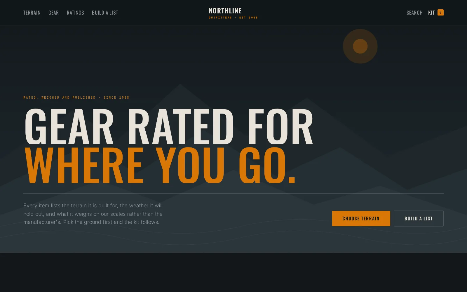
Desktop storefront design for Northline Outfitters: a dark slate page with layered ridgeline shapes, condensed bone and burnt-orange caps reading “Gear rated for where you go”, and an orange primary button.

Demonstration build · invented brand

Northline Outfitters

Outdoor & adventure gear · Rugged cinematic

Layered slate ridgelines behind condensed caps, with a single burnt-orange accent doing all the pointing.

Captures only

There is no live link, and that is deliberate.

These builds took real hours, and a competitor with a view-source window gets all of it for nothing. So we publish the pictures and keep the markup. What you can judge from an image is the design — the type, the hierarchy, the palette, whether it holds together on a 375-pixel screen — and that is what you were going to judge anyway.

How to read the set

The range is the point.

An apothecary and a sneaker drop should not look like the same shop wearing different colours. Put all 10 side by side and you can see whether we can actually change register — quiet and botanical here, acid-yellow and shouting there, instrument-panel dark somewhere else — or whether we only know one trick. Pick the one closest to your category and look at it on your phone.

Now point it at your own store.

The interesting question is not whether we can design a storefront — it is what is quietly wrong with the one you already have. The scan reads your live storefront the way a shopper’s browser does and tells you, with your own numbers attached. No login, no app install, and the findings are not held behind an email.